
Model error quantification
When we train a machine-learning model, we almost always report some performance metric, such as accuracy, recall, or F1-score.
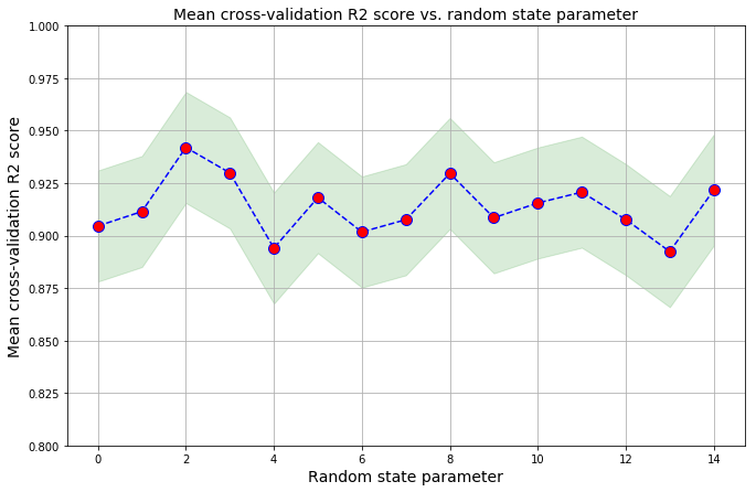
But there is some inherent randomness to this machine learning, and different training runs will result in different output metric values.
Benjamin Obi Tayo’s article “Random Error Quantification in Machine Learning” has a nice summary for how to quantify and visualize the error associated with your metric from the output of your cross-validation steps:
train_score = []

for i in range(n):
    X_train, X_test, y_train, y_test = train_test_split(
        X,
        y,
        test_size=0.3,
        random_state=i,
    )
    y_train_std = sc_y.fit_transform(y_train[:, np.newaxis]).flatten()
    train_score = np.append(
        train_score,
        np.mean(
            cross_val_score(pipe_lr, X_train, y_train_std, scoring ='r2', cv = 10)
            )
        )
train_mean = np.mean(train_score)
train_std = np.std(train_score)
print('R2 train: %.3f +/- %.3f' % (train_mean,train_std))

plt.figure(figsize=(11,7))
plt.plot(range(n),train_score,color='blue', linestyle='dashed',
         marker='o',markerfacecolor='red', markersize=10)
plt.fill_between(range(n),
                 train_score + 2*train_std,
                 train_score - 2*train_std,
                 alpha=0.15, color='green')
plt.grid()
plt.ylim(0.8,1)
plt.title('Mean cross-validation R2 score vs. random state parameter', size = 14)
plt.xlabel('Random state parameter', size = 14)
plt.ylabel('Mean cross-validation R2 score', size = 14)
plt.show()
You can see the full details in the associated Jupyter Notebook.


Leave a comment